Role:
Information Architect, Primary UX Researcher & UI Designer
About the Project:
My initial search idea was simple. Let the user select what they wanted to search for, and give them an easy interface. Give them a UI that they are accustomed to seeing.
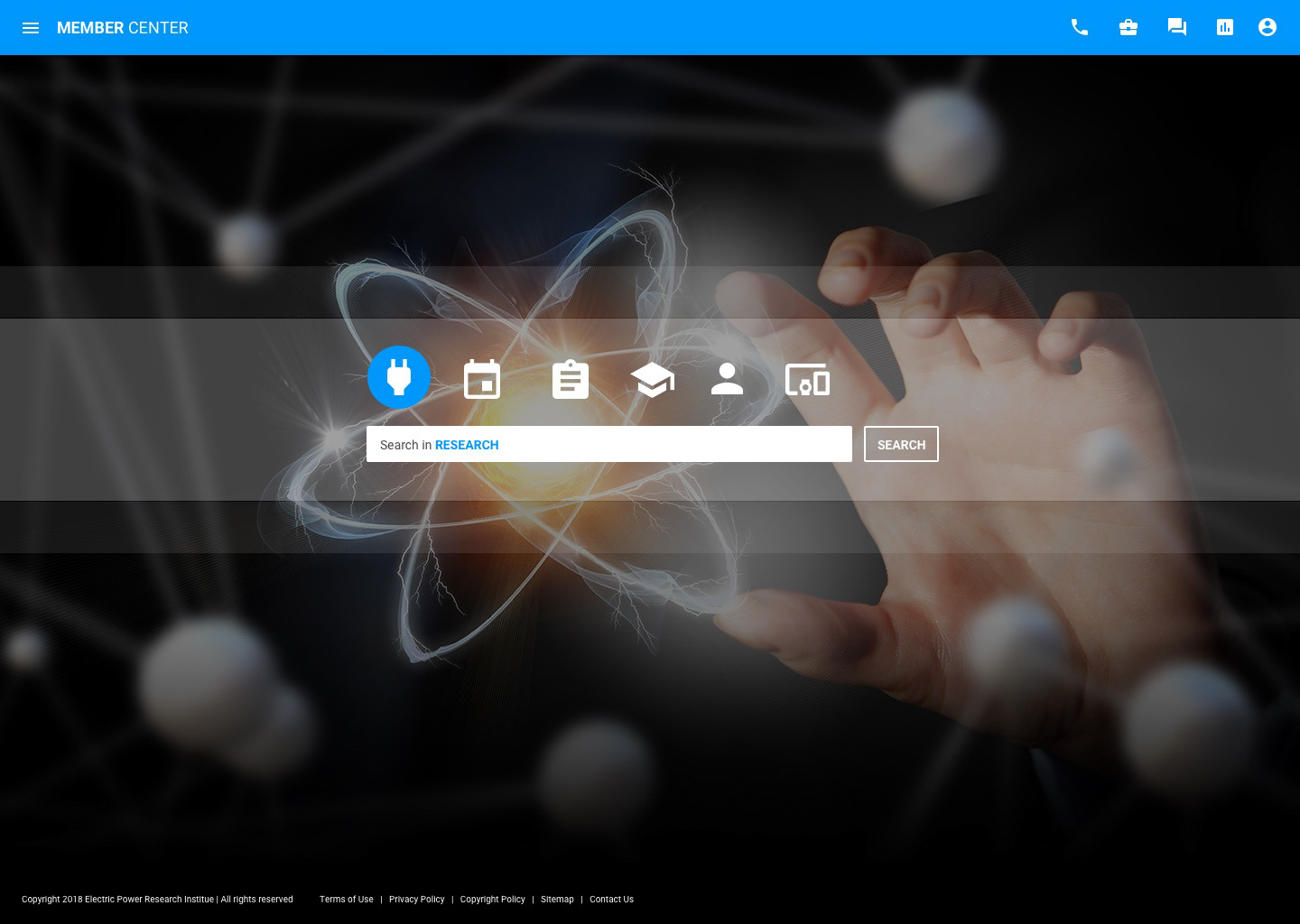
The requirements changed several times during the project, but I was able to implement something similar into the site that would make searching a whole lot more simple.
The video below shows how we implemented the simplistic search interface with a basic overlay that allows the user to select the type of information they want to search for. From there, the user is able to refine the search results by the filters on the left.
Within the search results, either a locked icon (meaning, no access) is displayed or not, depending on both a user being logged in and the user having access to the research listed.
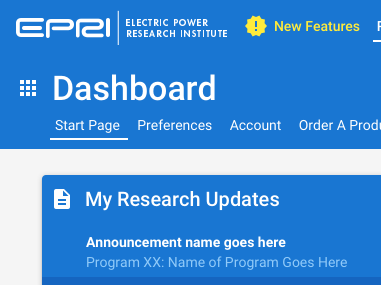
When logged in, the header is blue; when not, the header is dark gray.
I reinforced this concept throughout the rest of the site so that the user understood if they were logged-in or not, and if they had access to the material or not.
The video below shows what the UI looks like and what the experience is when a user is not logged in, and how it changes once a user logs-in.
Our previous search made it really difficult to find and download attachments from events that had happened previously. I proposed that we fix that in the new Search UX. Additionally, we used to display event attachments by themselves; Now they are grouped together with the event that they pertain to.
The video below shows the journey a user takes when looking for a specific file that was either created by or created for an event.