Role:
Information Architect, Primary UX Researcher & UI DesignerAbout this Project:
About this Project:
For this project, I formally interviewed internal stakeholders, customers and led UX sessions to understand what were the most important issues to address before we even started down a monumental path.
I then met with our larger team and helped devise a site architecture and technology plan. We went through ideation rounds of wireframes and middle fidelity mocks, gathered feedback and solidified the UI.
I created our own EPRI Design System based on the Material Specification, wrote stories in JIRA, provided Functional Specification Documents, and performed quality assurance testing in various phases of the project.
The Problem
The concept was to take two separate websites - one public and one private - and combine them into one. EPRI serves the public as well as their Member companies, and the disparity between the two sites was monumental.
We needed to figure out a way to show pages that weren’t public previously to the public, but still protect sensitive information.
Gathering Insights
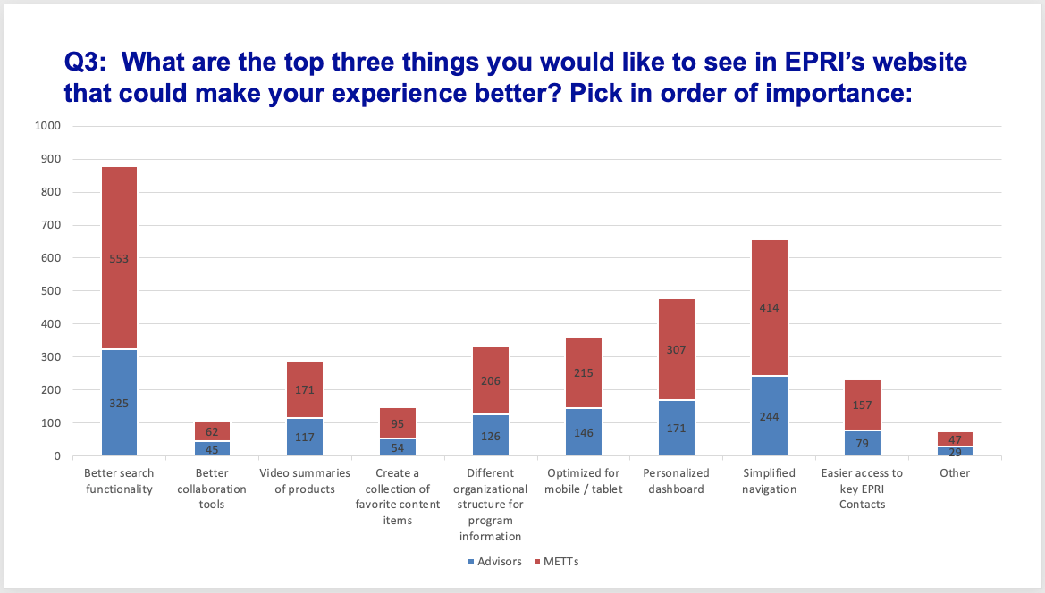
We had our assumptions, but needed to find out what was important to both our internal users and our customers.
I interviewed over 50 internal users, which allowed me to arrive at some common issues. I then led several small sessions with our Members to understand what their pain-points were, then took those same questions and asked our EPRI staff what their opinions were.
From there I took the data and created a unified visualization to illustrate where the problem areas were and what the scope should be.
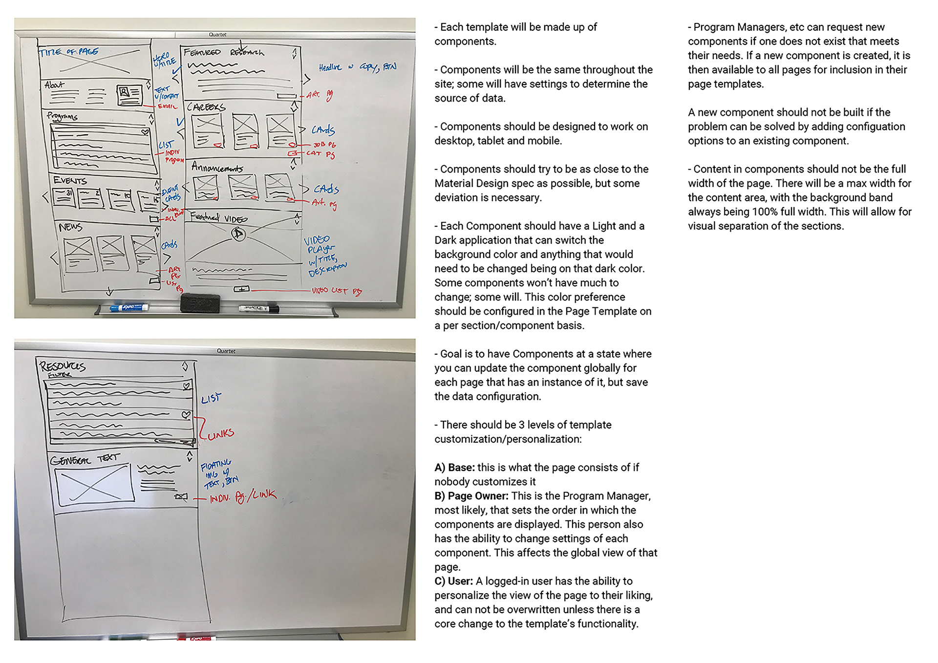
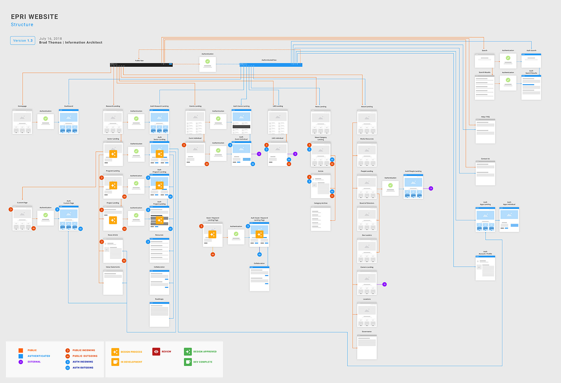
Early notes on components and structre
Ideation
Sometimes this is the fun part. It can also be a point in the project that causes significant problems if the technology and requirements are not solidified.
As the Information Architect for this project, it was clear to me: there were so many areas where we could utilize components that it only made sense to work from a component level and re-use these components with specific configurations where necessary.
However, when you are working with several different stakeholders who have differing agendas, experience, and understanding of UX, it makes the path forward unclear.
We went through several rounds of ideation, with different stakeholders, staff and management.
I first started with sketches on a whiteboard with notes. I then would take photos of those sketches and type up the notes. We would have meetings to discuss those, and as those were agreed upon, I would then refine those into wireframes and then eventually into mid fidelity mockups to get feedback, with the end result being high-fidelity designs for the Developers to build from. Those high-fidelity designs were created in Sketch and posted to InVision to utilize its Inspector tool.
As the situation stabilized and the restrictions became clear, we ultimately were able to solidify the requirements and then craft a solidified UI.
Solutions
Once we understood the problems, we could then devise some solutions as we worked through our visual design.
A) Reduce Confusion
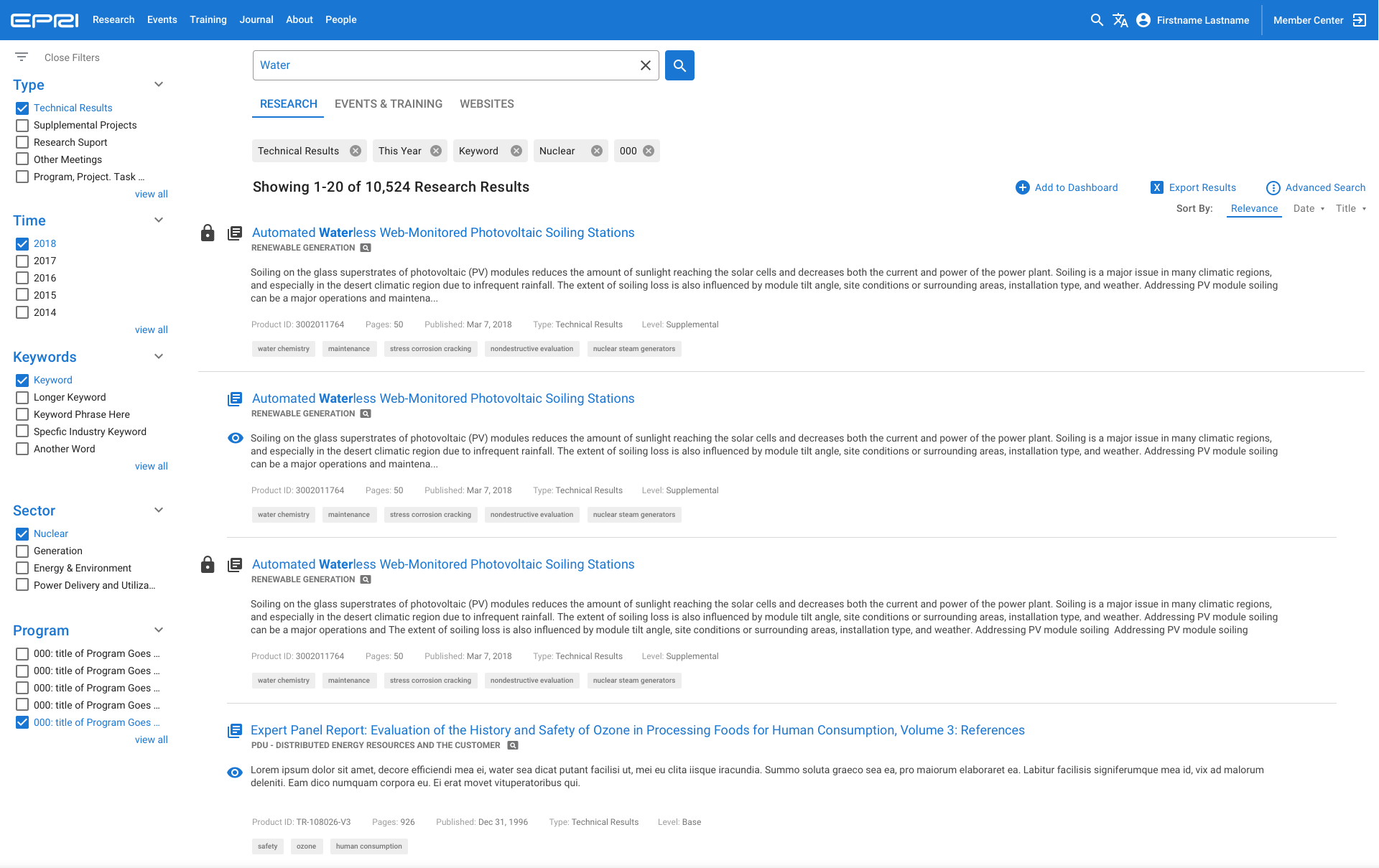
Search and downloading are the primary reasons members use our website
We have made it easier to find and download research by integrating EPRI.com with Member Center, resulting in less friction.
Our New Search Engine spans both public and authenticated users, instilling a consistent user interface and user experience. We designed and built the new Search UI to be extensible; It’s not only for EPRI.com but for things like the Tech Portal and any Subscriber Website.
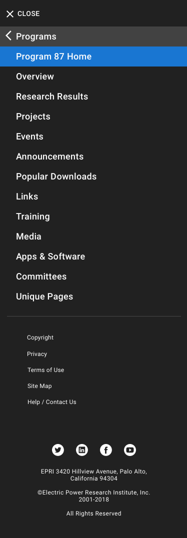
B) Simplify Navigation
Users want a more simplified navigation; Inconsistency and Unorganized navigation in Member Center was confusing and cumbersome
We simplified our navigation and introduced our contextual secondary navigation bar to allow us to show complex navigation when a user needs to see it. We worked with stakeholders to streamline levels of navigation. Our decisions were based on surfacing the most widely used sections of the site as well as grouping of analogous pages for ease of cognition.
C) Responsive Design
Users want Member Center optimized for Mobile and Tablet
We made the site responsive to work on mobile and tablet by introducing new front end framework technologies and carefully designing and crafting our components to work on any device.
D) Create Ease of Use
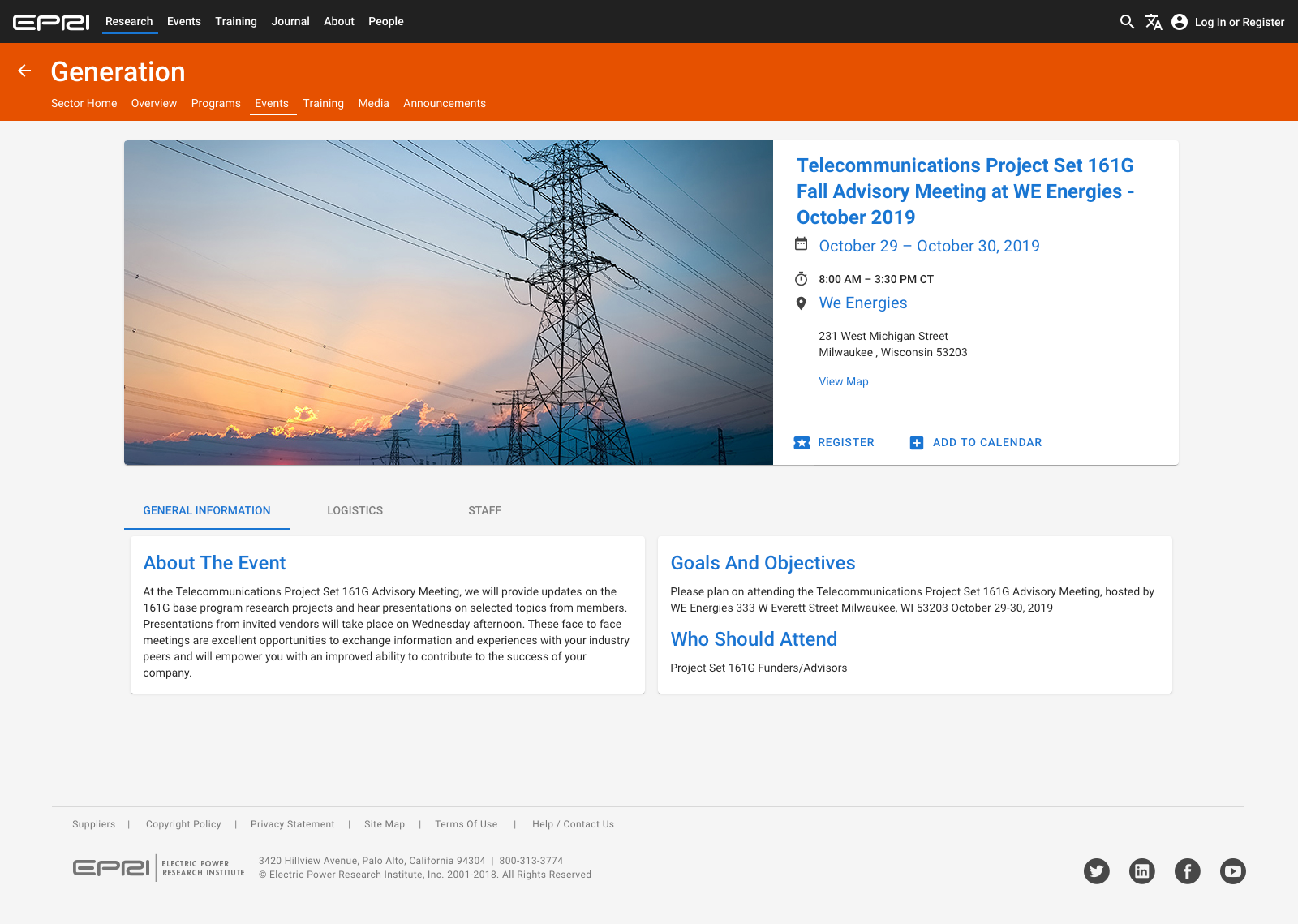
Users want the ability to find meetings, webcasts and their associated documentation easily
We rearchitected, redesigned and built a new Events display system, comprised of specialized components, allowing for better insight of events site-wide. Our new Calendar Application helps to give a glance on what is upcoming and what took place. This new Events User Interface is not dependent on any third-party service and can be adapted and extended with any technology chosen in the future for continued consistency.
E) Increase Speed of Updates
Users and EPRI Staff both say that speed of updates and transparency into EPRI processes are important
We have created and built a new site architecture and instituted a new content management system to enable self service.
F) Increase Speed of Development
Users and EPRI Staff both say that speed of updates and transparency into EPRI processes are important
We created new, flexible and uniform page components to aid in delivering information efficiently, predictably and with consistency.
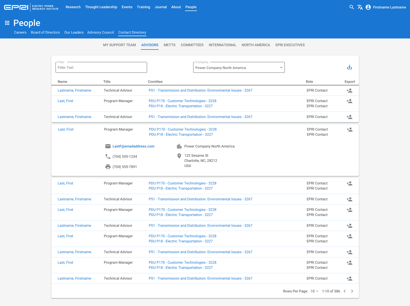
G) Ensure Users Can Get Help Easily
Finding the correct EPRI contact and contacting them is important to our users; Live Chat with someone who can help them is something our users would use
We improved the ability for users to get help by including the Floating Action Button at the bottom of every page, which can be expanded in future phases to include the initiation of Live Chat capabilities. We also created a standard for Contact Cards, which allows us to expand its capabilities in the future.
H) Help Users Understand Their Access
Easily understanding what they have access to is important to our users
We have instituted a Lock/Unlock Icon System to enable users to easily see what they have access to, in addition to creating the top header color change from dark gray to blue when a user is logged in. This change is also accompanied by subtle changes in the header for account access, access to the Dashboard and access to METT Central in the future.
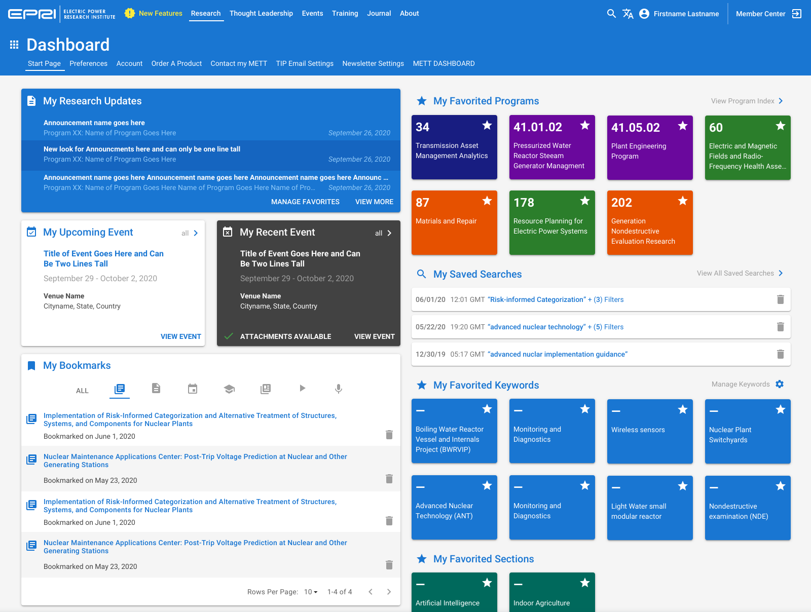
I) Reduce Friction to Data
Users are very receptive to the Dashboard concept and would find it very useful
We have researched, created, and iterated through Dashboard designs that make it easier to navigate and use EPRI information that our Members personally care about. Our information was based on interviews with Members and what is important to them. As our data capabilities became solidified, we then were able to then focus on how to enable our users to use our site the way that they choose. Our first monumental task was to create underlying technologies to enable the population of the information in order to display it.
Validation
As we moved ahead, we were able to create our mid-fidelity prototypes for testing. We opened up our environment internally first to a select set of users. One of the first features we created was a feedback component that we utilized to collect feedback on an individual page level. We then were able to open it up to a subset of our customers for their feedback. Based on that feedback, we were able to hone some of our features and finish sections of the site incrementally.
Results
After a rocky start, we arrived to the finish line. It was a clear example of how an idea can only get you so far, and that a project has to have the technology and security requirements solidified before work can begin. Having too many stakeholders will result in a less than ideal experience, needless rework and a lot of questions.