Role:
Information Architect, Primary UX Researcher & UI Designer
About the Project:
Creating a dashboard is no easy task. It takes a lot of research, defining and building of content architecture, components and features. I worked on and off on this idea for over two years.
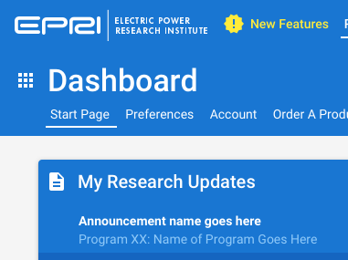
Previous to this, there was a simplistic SharePoint start page. It was essentially a dumping ground for announcements and info that users generally ignored. Through my research, I discovered that the members primarily cared about their specific research areas, what is going on around them, and how to find what they were looking for quickly.
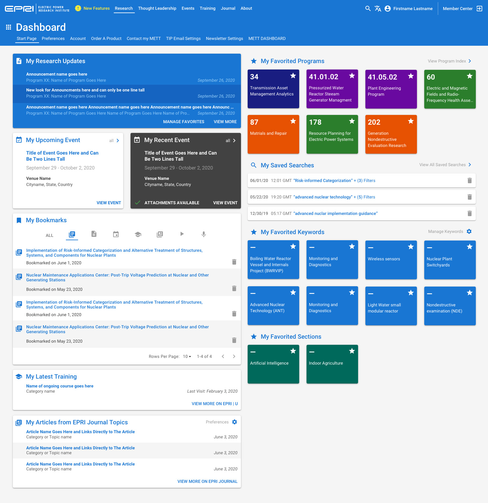
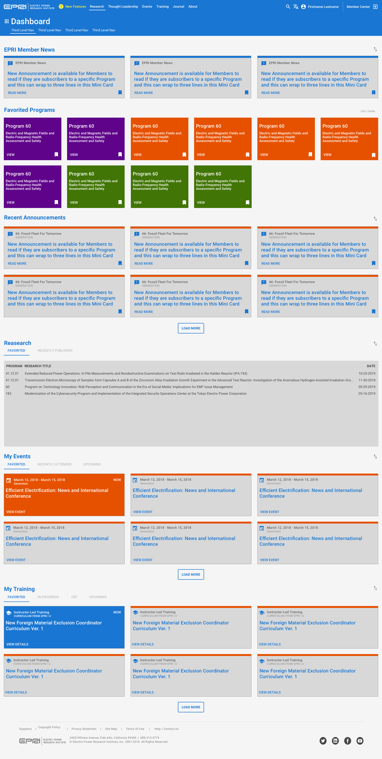
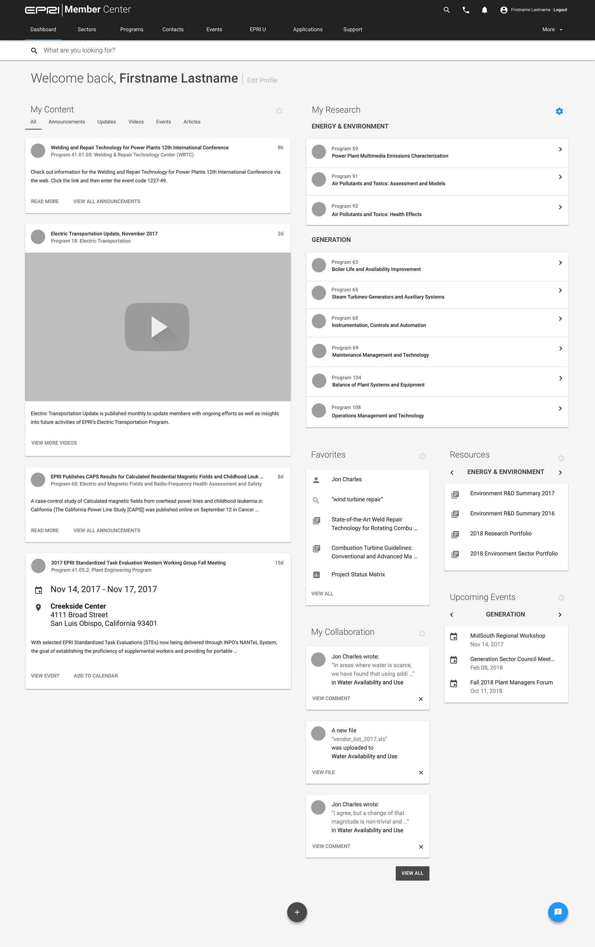
One of the concepts that I came up with was the idea to create a user-centric dashboard that surfaces the things that the user cares about front and center.
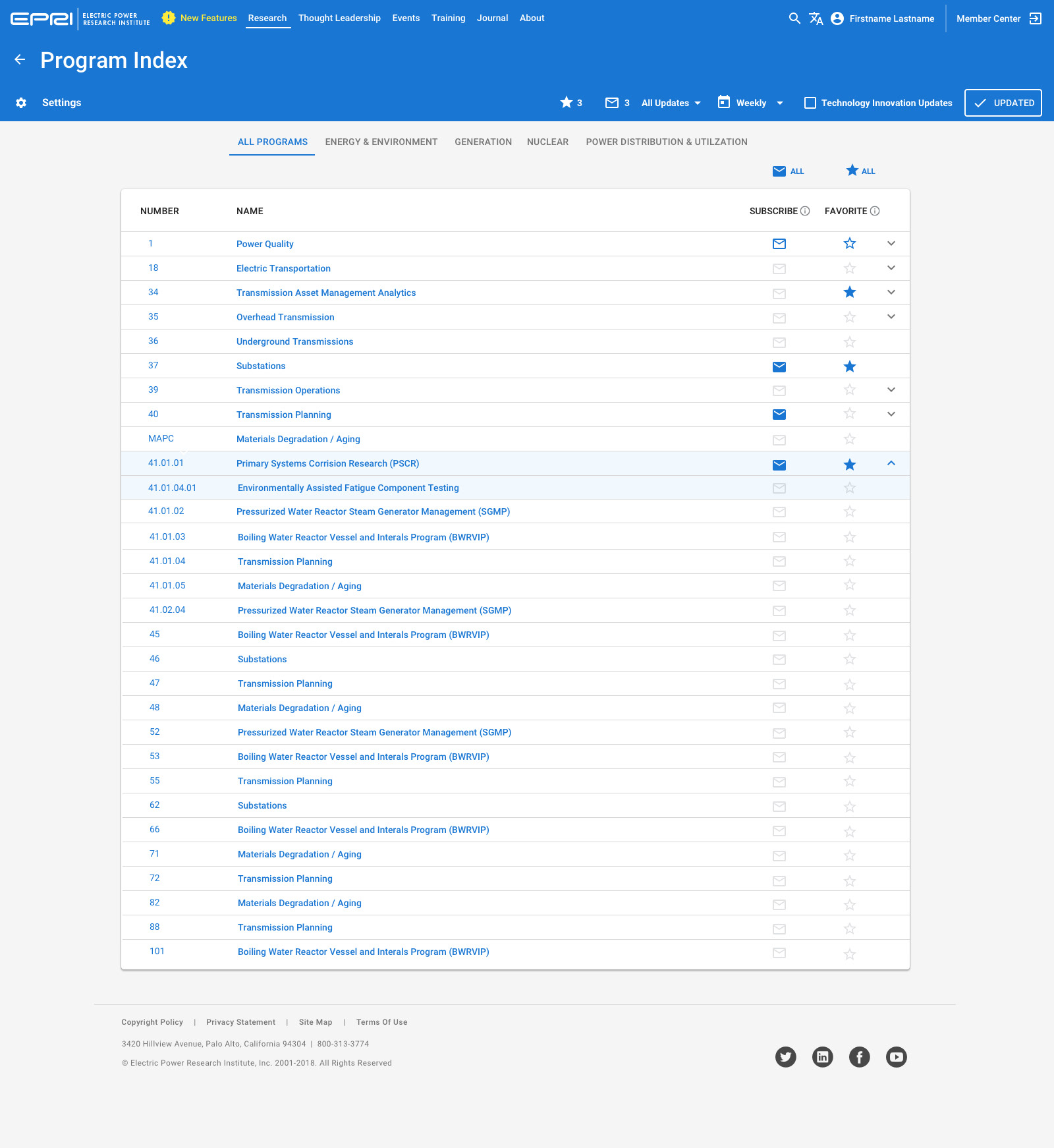
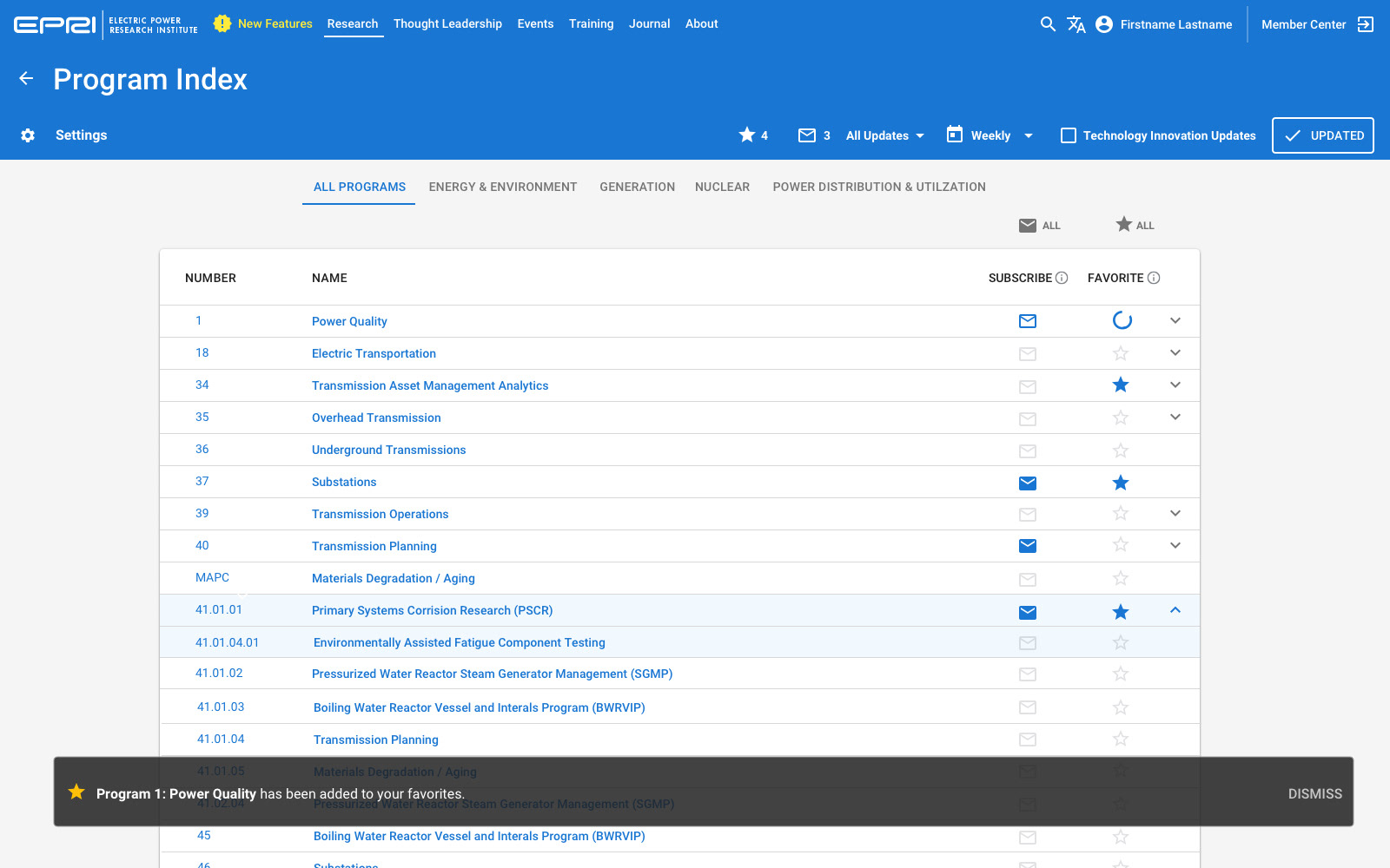
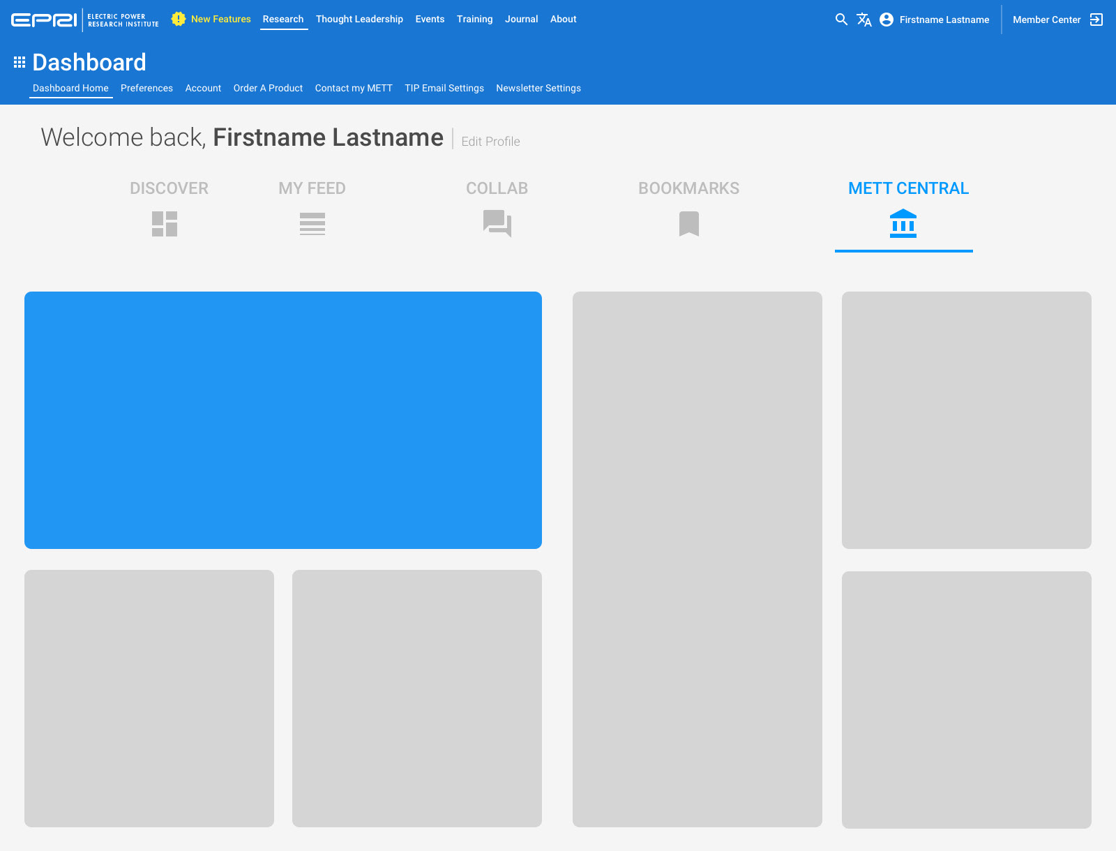
We created the ability to favorite specific Research Programs, which then pulls the data like announcements and events to the forefront without making the user navigate to them.
Future enhancements will allow the user to save searches, favorite keywords and follow specific sections of the site that are not tied to a specific research program.
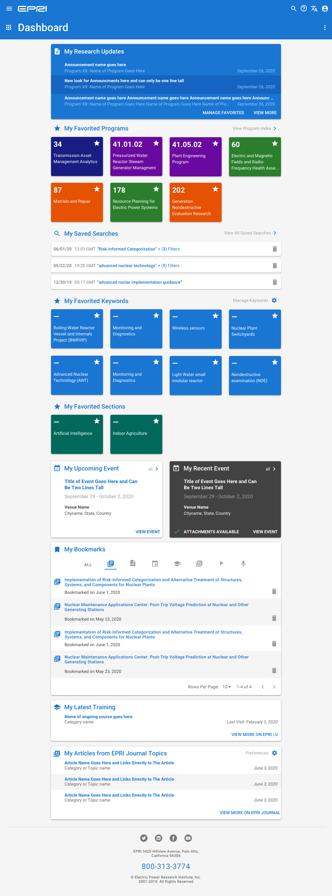
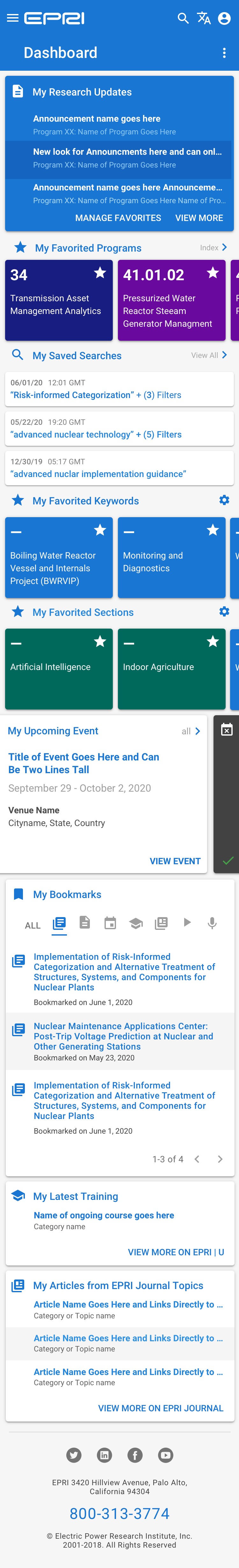
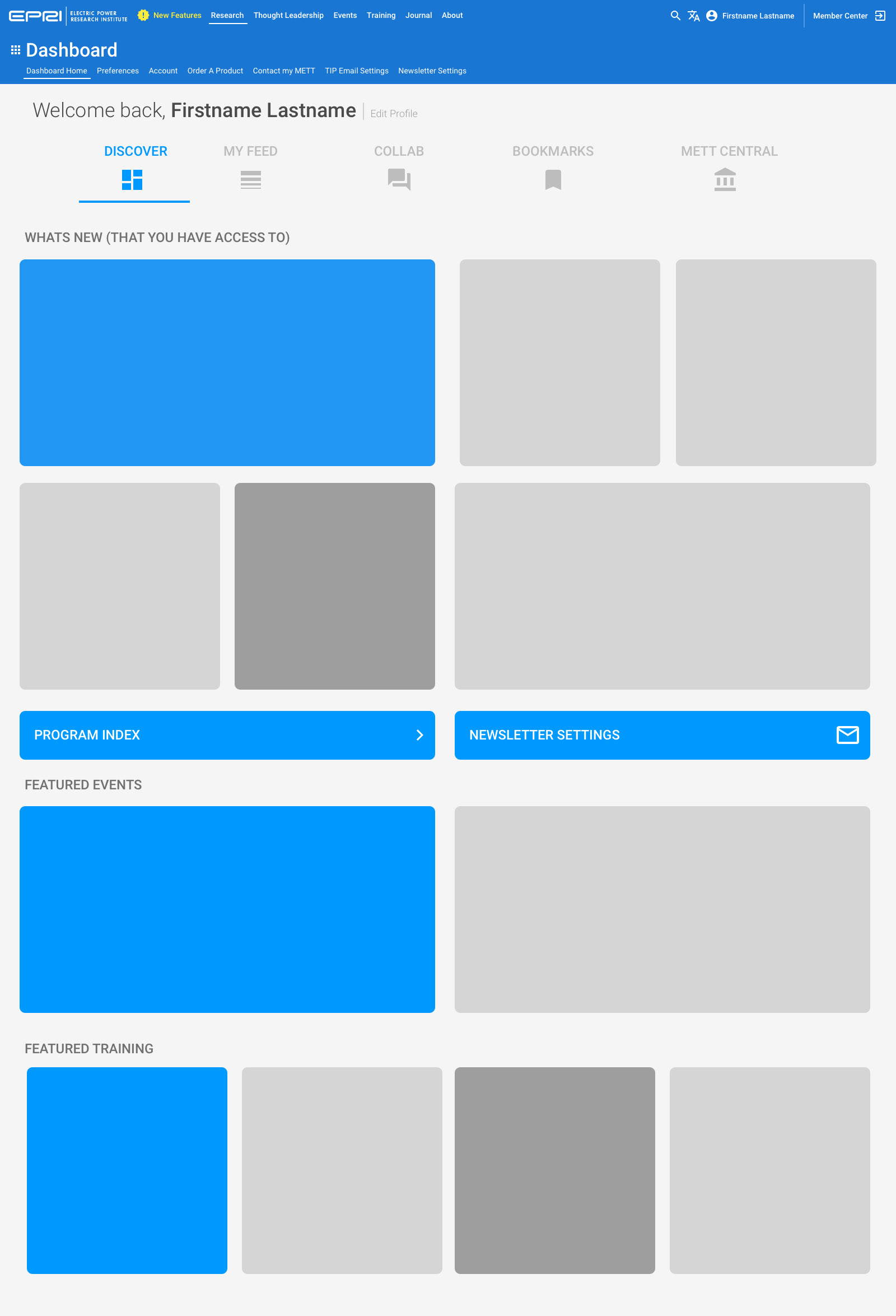
Responsive view for Tablet users, which didn't exist before. EPRI largely ignored Tablet and Mobile users previous to this project.
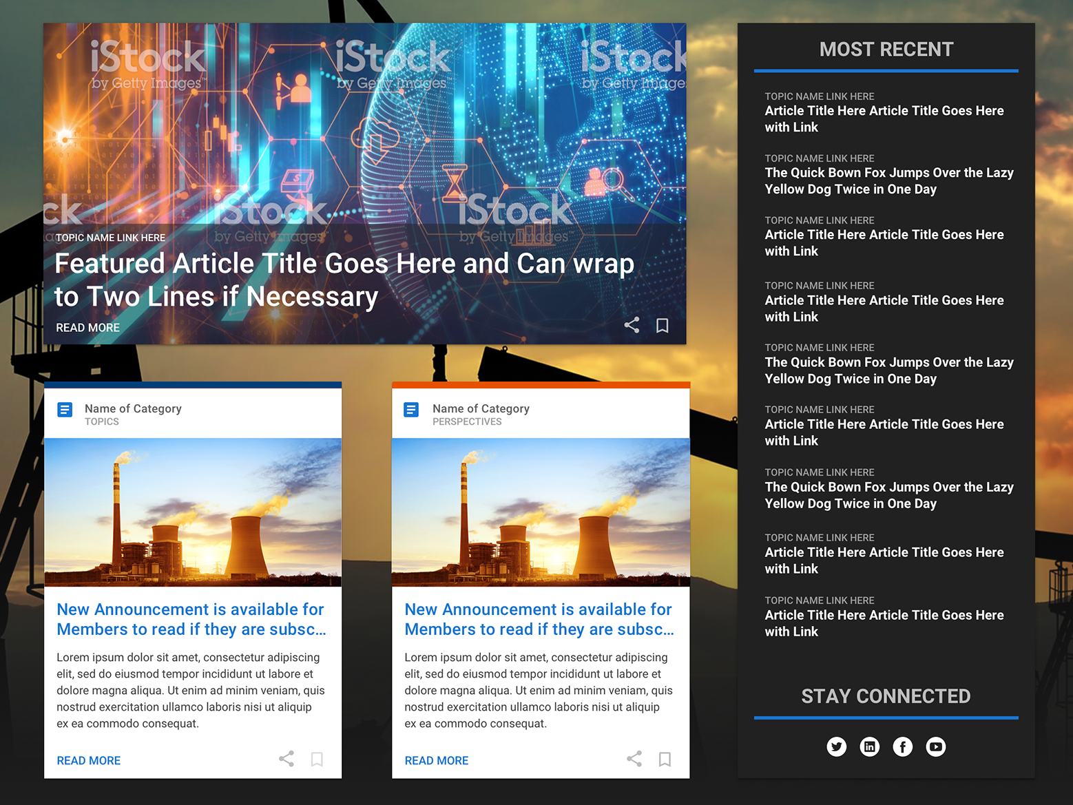
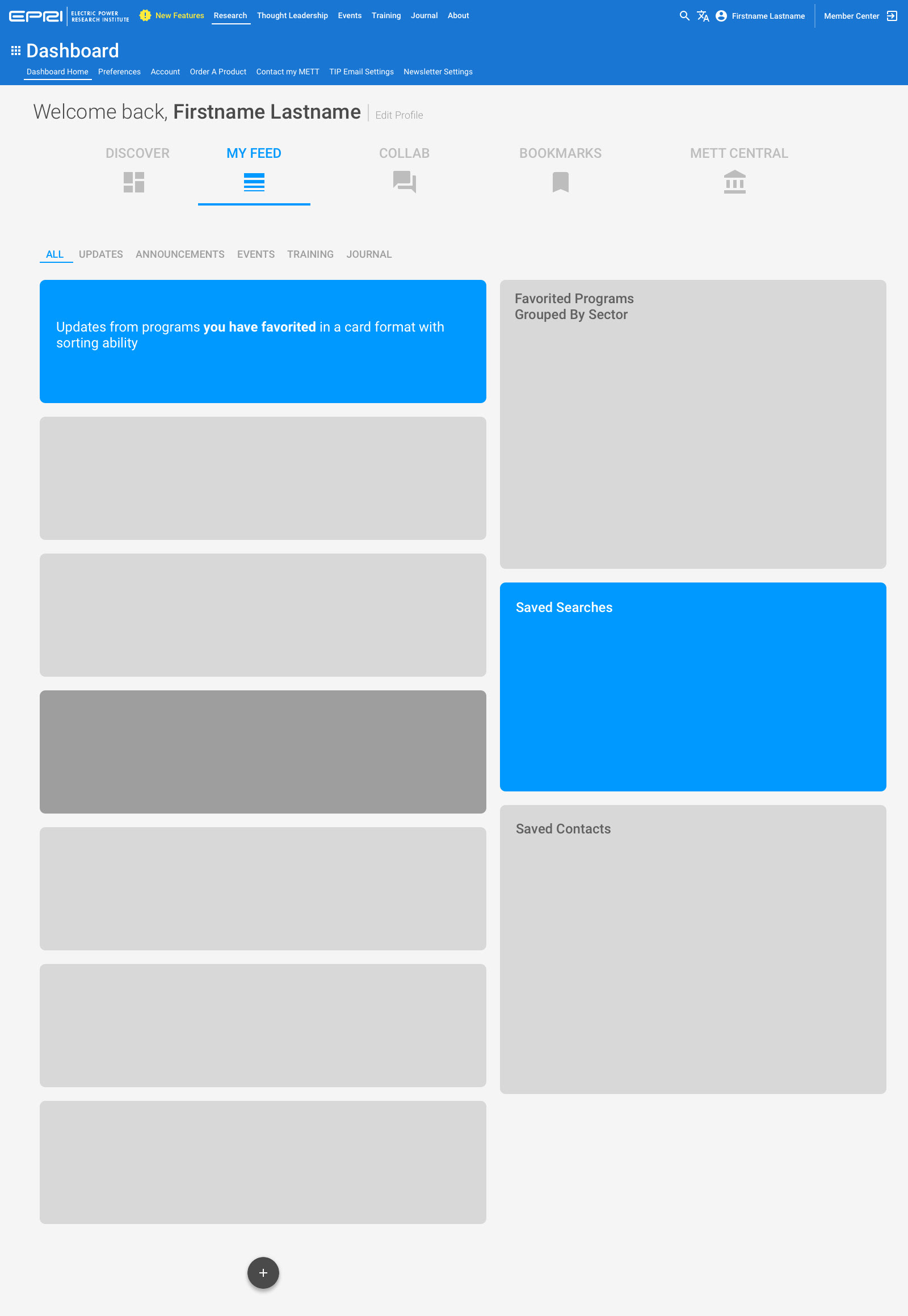
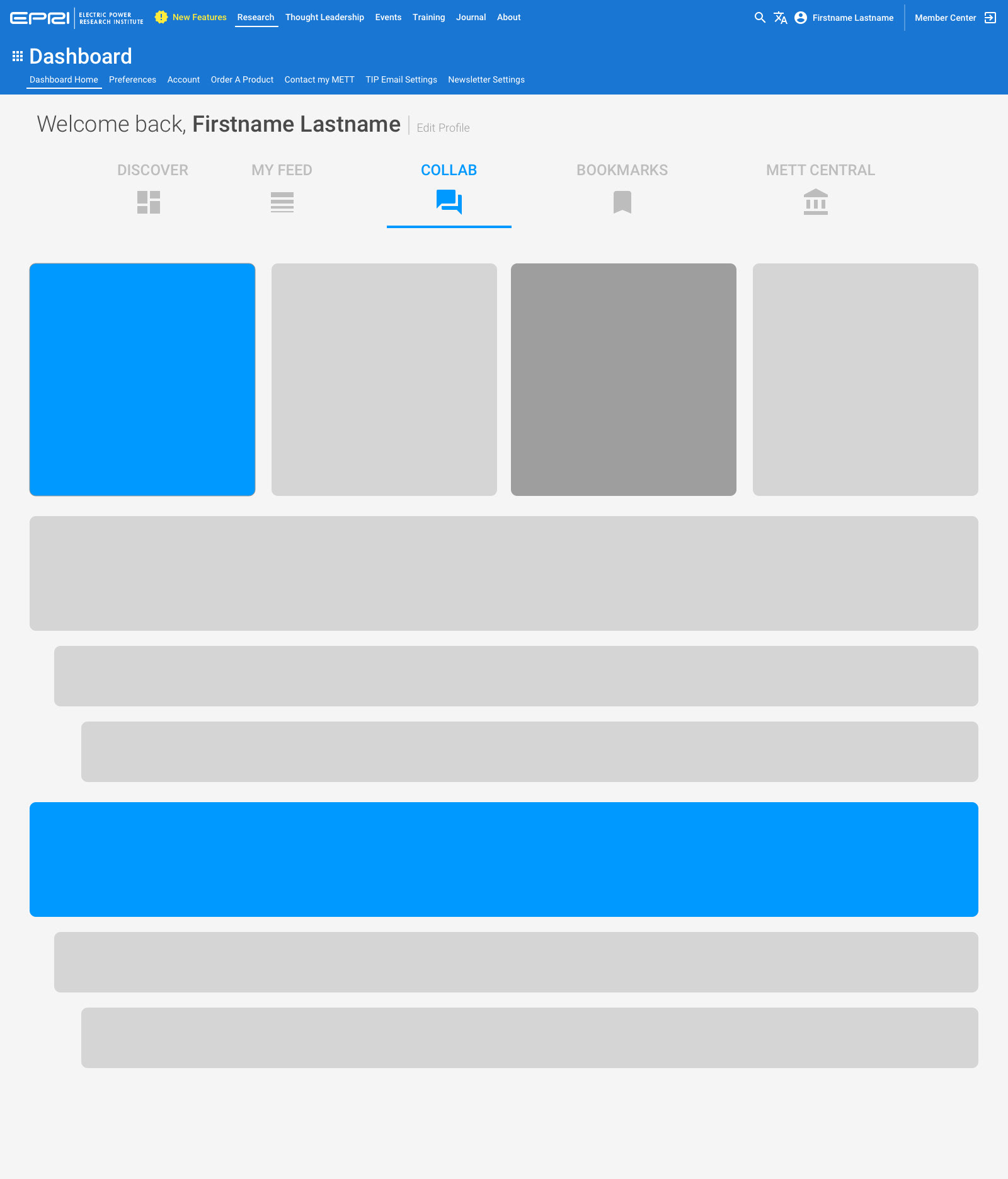
Once we had the content structure built, it was time to figure out how it all came together.
Below is one of my early wireframe concepts for content ideas.
This idea stemmed from these wireframes, where we put similar functionality grouped into tabs or pages. Click on a thumbnail to view the full image.
Shortly after my initial interviews in 2018, my first thought was to create a Facebook-esque version of what the site homepage would be like. I envisioned the dynamic stream on the left would be the place that would show the latest information from the various research programs, and the column to the right would be the place where the static links to items would live.
After further research with the business, I learned they didn't post content this way. Many times, various programs would simply dump information all at once, or post the links to their events for the year all at once, thus negating the usefulness of the stream altogether.
In order to populate the dashboard, we had to create the ability for users to determine what was important to them throughout the rest of the site.
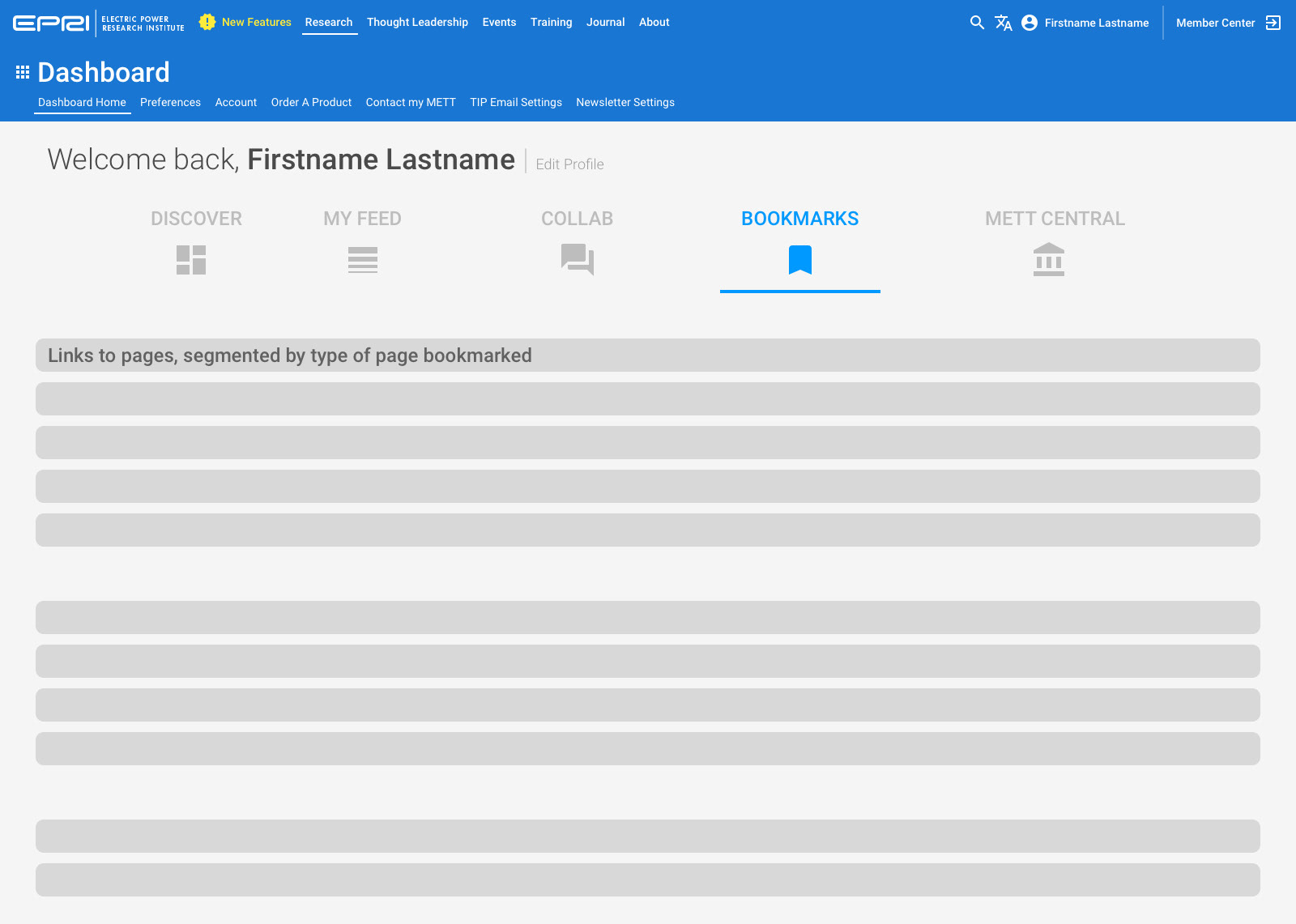
To do this, we created the ability to favorite and bookmark information in various places on various forms of content.
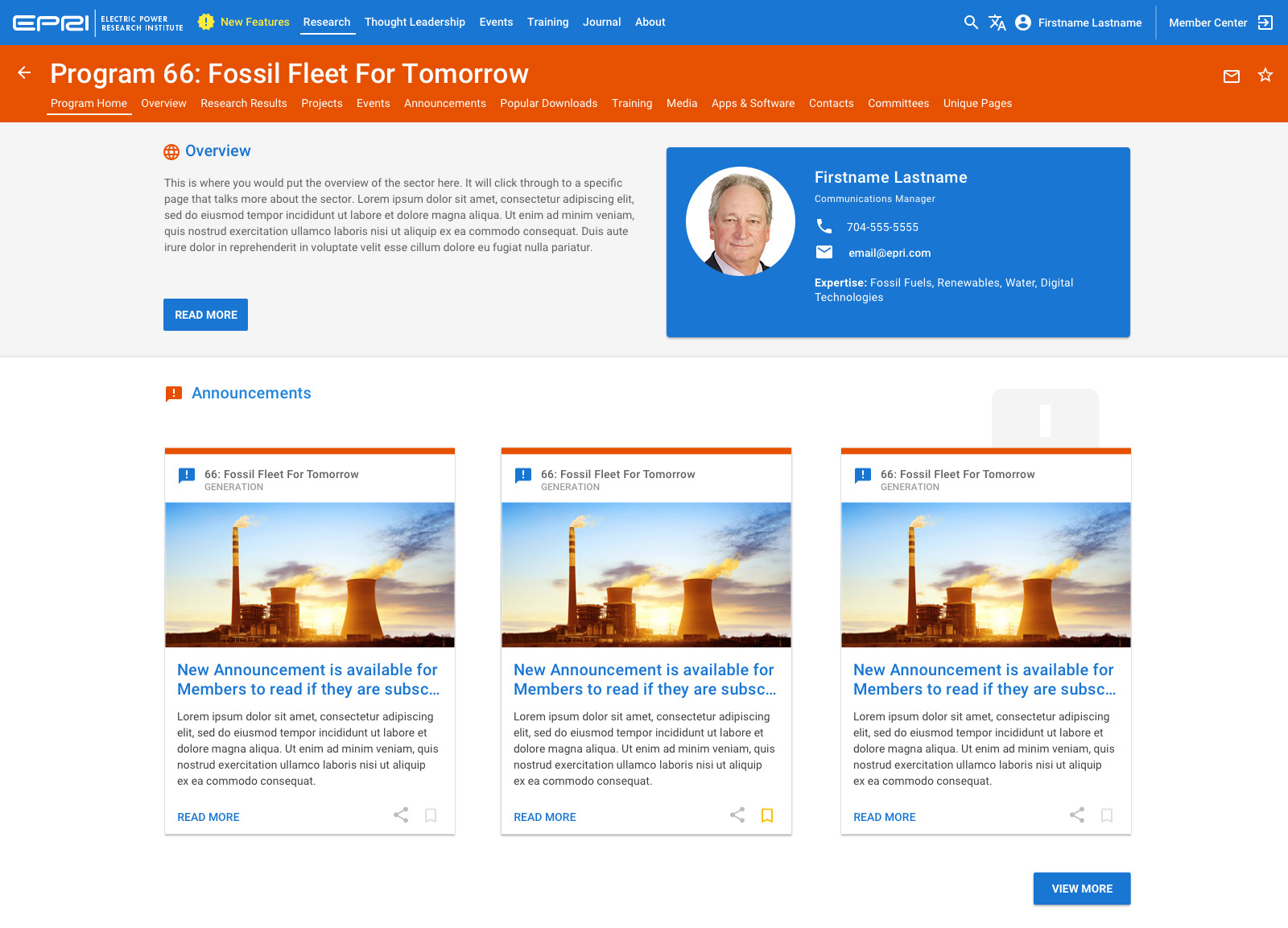
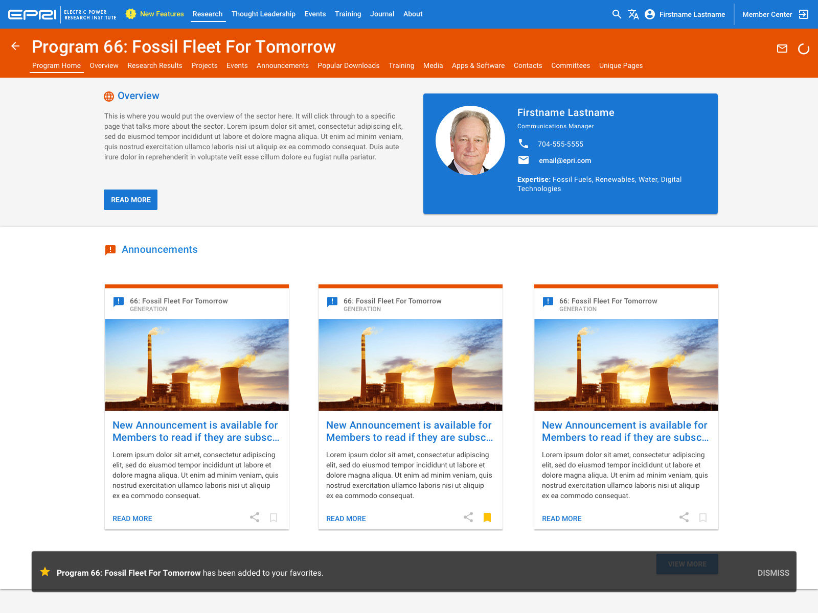
Specific categories of information can be Favorited, which is signified by a Star icon. That information will be available in various widgets within the dashboard, and will populate the stream of information as it is published.
An individual item within that stream can be bookmarked, which is shown using the Bookmark icon. Once bookmarked, it populates the specific bookmark widget on the dashboard, where it can be sorted by content type.