Role:
Information Architect, Primary UX Researcher & UI Designer
About the Project:
One challenge for our new EPRI website was to figure out a new way to display calendar and Event information in an interesting way. One concept I had was to color-code the sectors with specific colors for easy differentiation. Another was to modularize the panels, so that on a desktop you would see the full spread of information on one screen, but for mobile, you would only see what you needed to.
These mockups were early on in our design process, and were not fully adopted by our stakeholders, but nonetheless, the ideas were a good illustration of where we need to be.
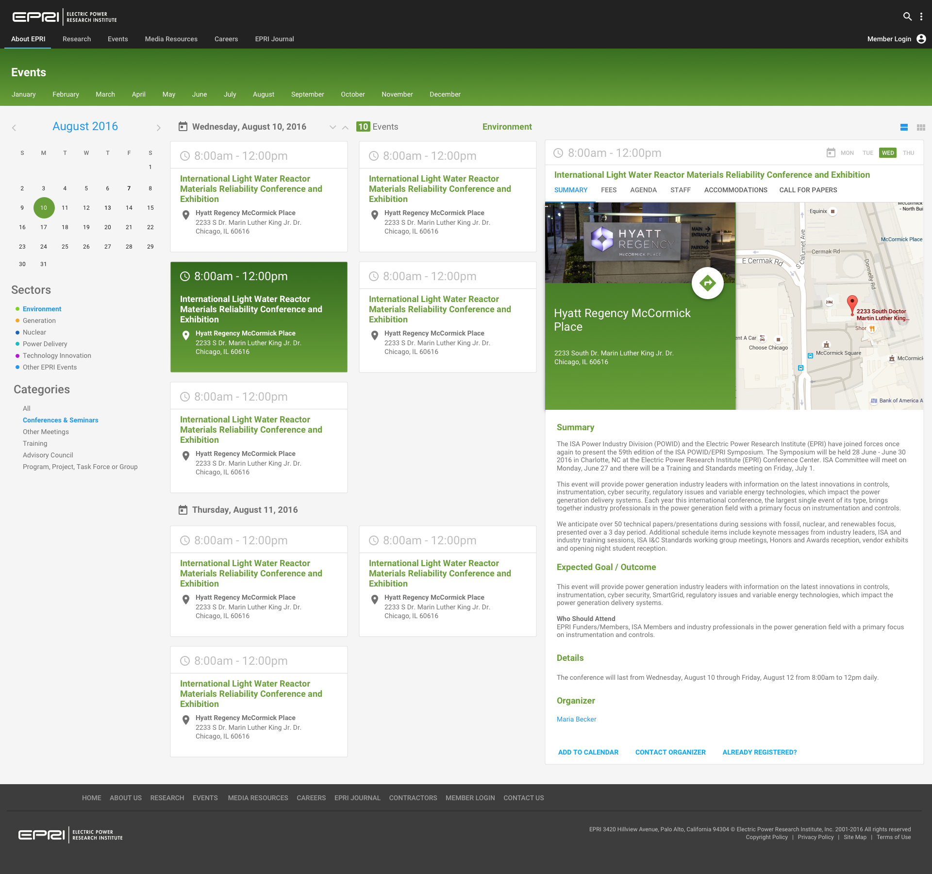
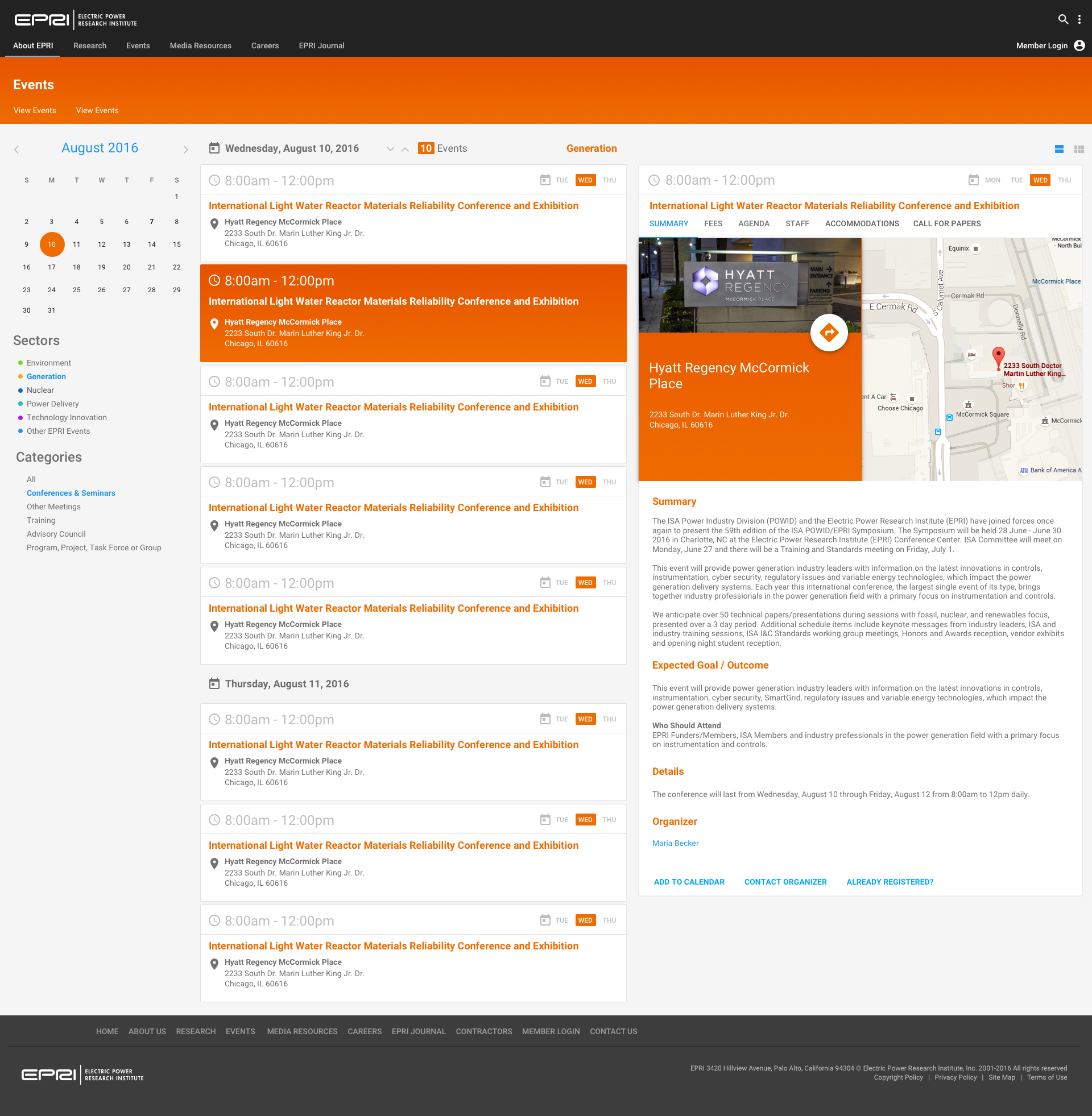
You can see the modular way the page operates, with the filters along the left side, and the toggles for the date and views along the top. On the right side of the page is the panel that shows the event details, with the selected event highlighted in the designated sector color.
For Mobile, the default view is the listing of the cards, with the panel to be opened with a filter button, and the details view to open in place of the listings.